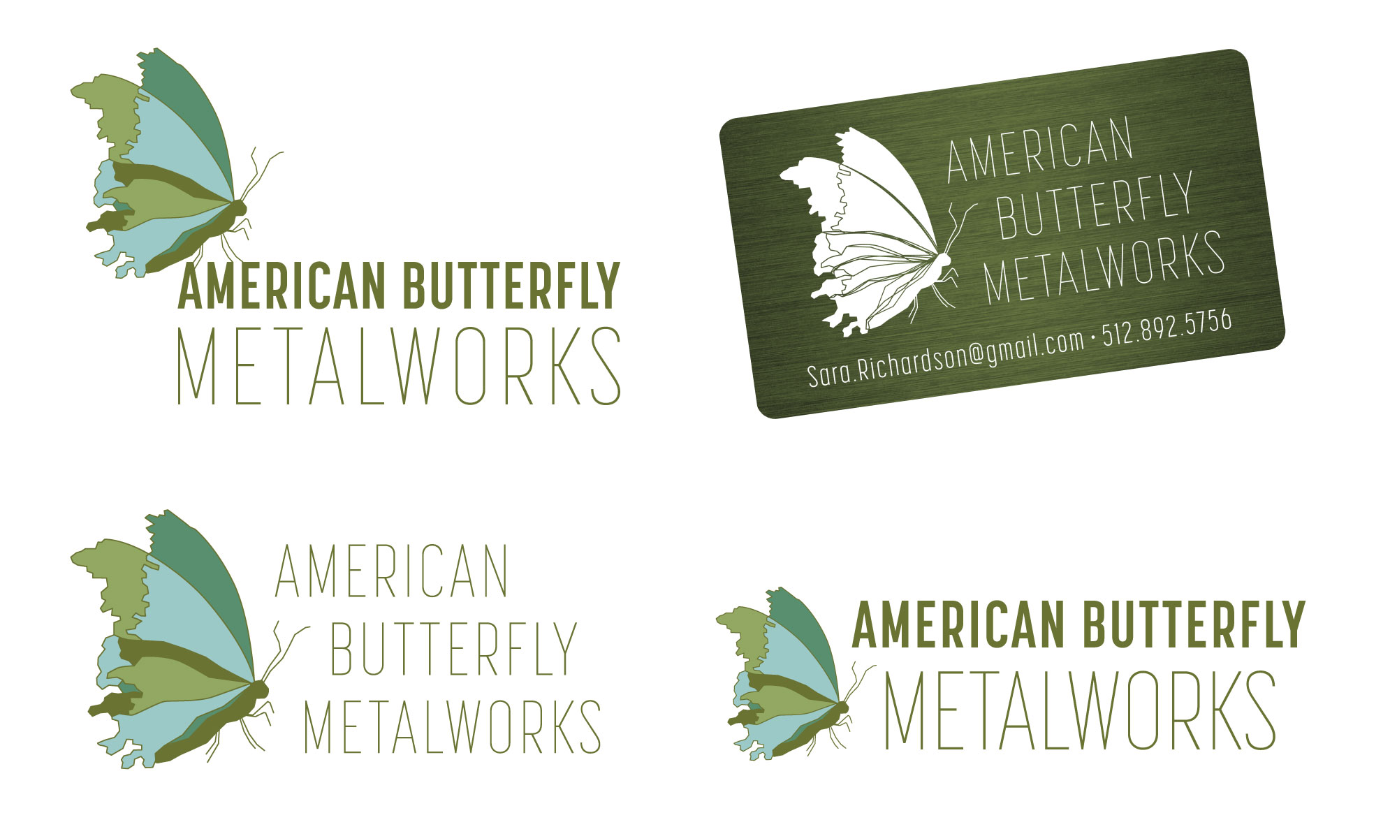
I designed this logo and business card for a local artist and freelance client. I used linework to mimic the look of her bent metal artwork, and I proposed a laser cut metal business card.
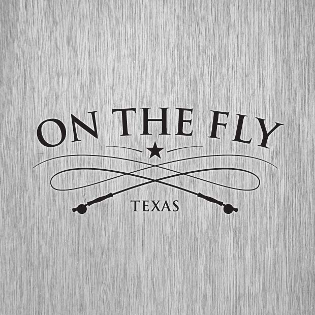
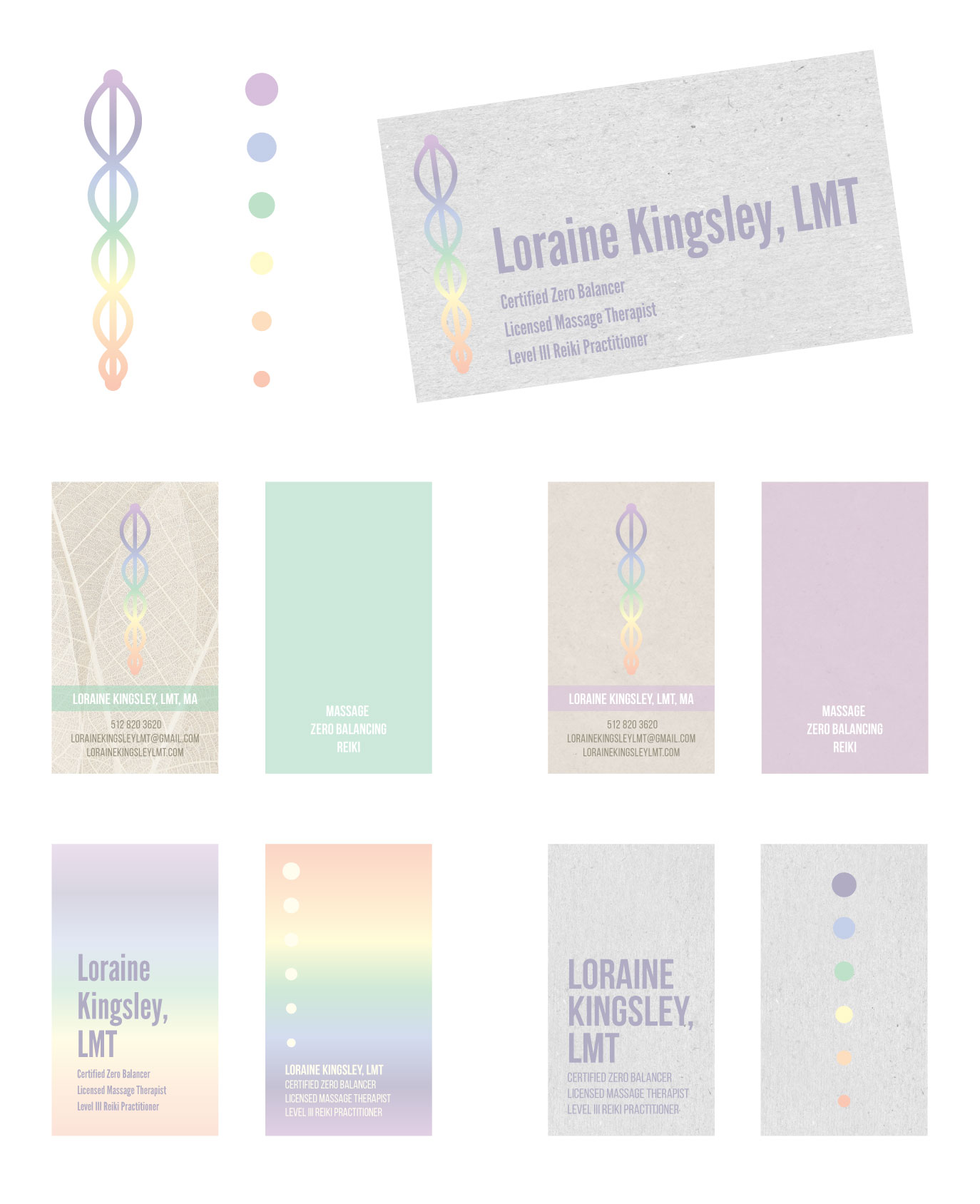
I designed this logo, secondary logo, and several business card options for a freelance client and friend. I used twin spirals referencing the caduceus symbol combined with the rainbow colors of the chakra and neutral background textures for contrast.
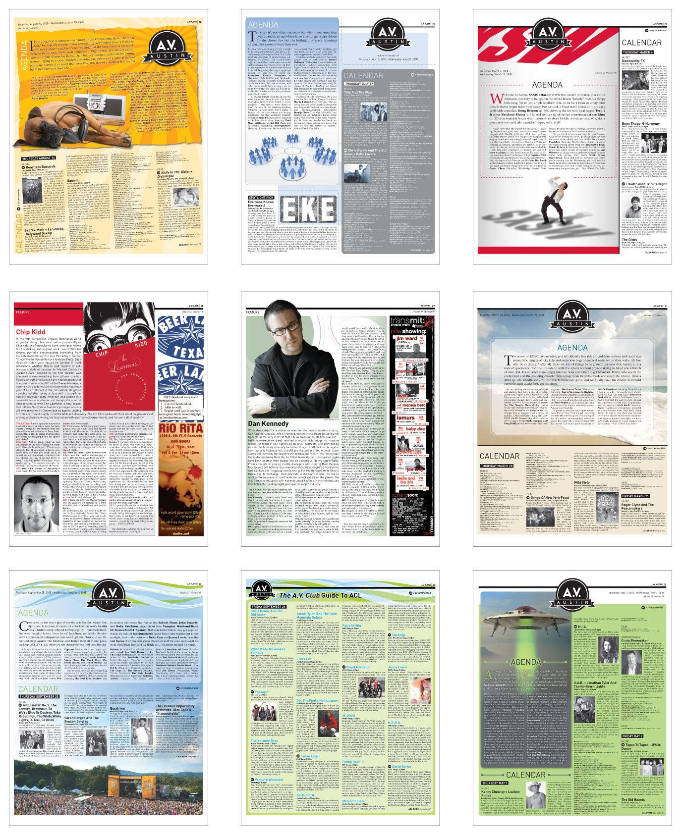
I have designed and produced several publications, and I love editorial design and layout. Here are some of my favorite layouts that I designed for the A.V. Club section of The Onion newspaper. The features called for a wide variety of looks within an established structure, and I had so much fun with these each week.
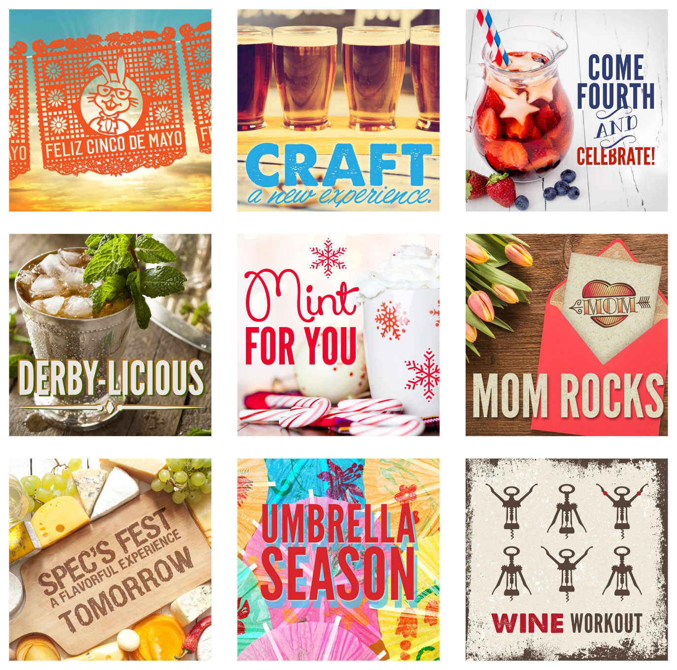
I designed a wide variety of social graphics for Spec’s holiday specials and promotions. I was given headline copy and free rein with our stock photography account. I especially enjoyed the opportunity to play with typography in creative ways on these small compositions.
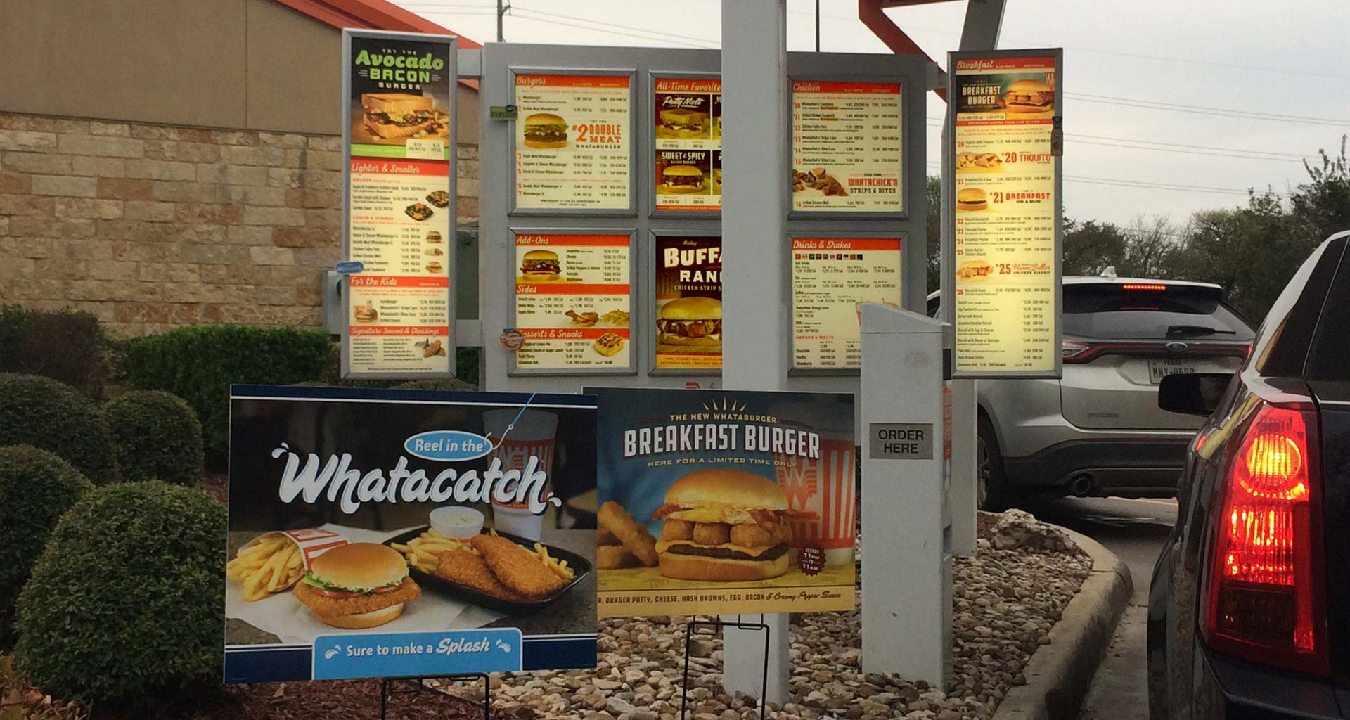
As a production artist, I have proven capability and reliability with a huge variety of Whataburger print and digital pieces. I worked on multiple high-visibility projects with short timelines, and I have never missed a deadline. Menus and POP art shown below are distributed quarterly to units nationwide along with all interior and exterior building clings, menus, and signage. See the “Production Art” section of this site for more projects including murals, bus wraps, and billboards. Please note I did not design the pieces in the photo below – my role was production artist only.
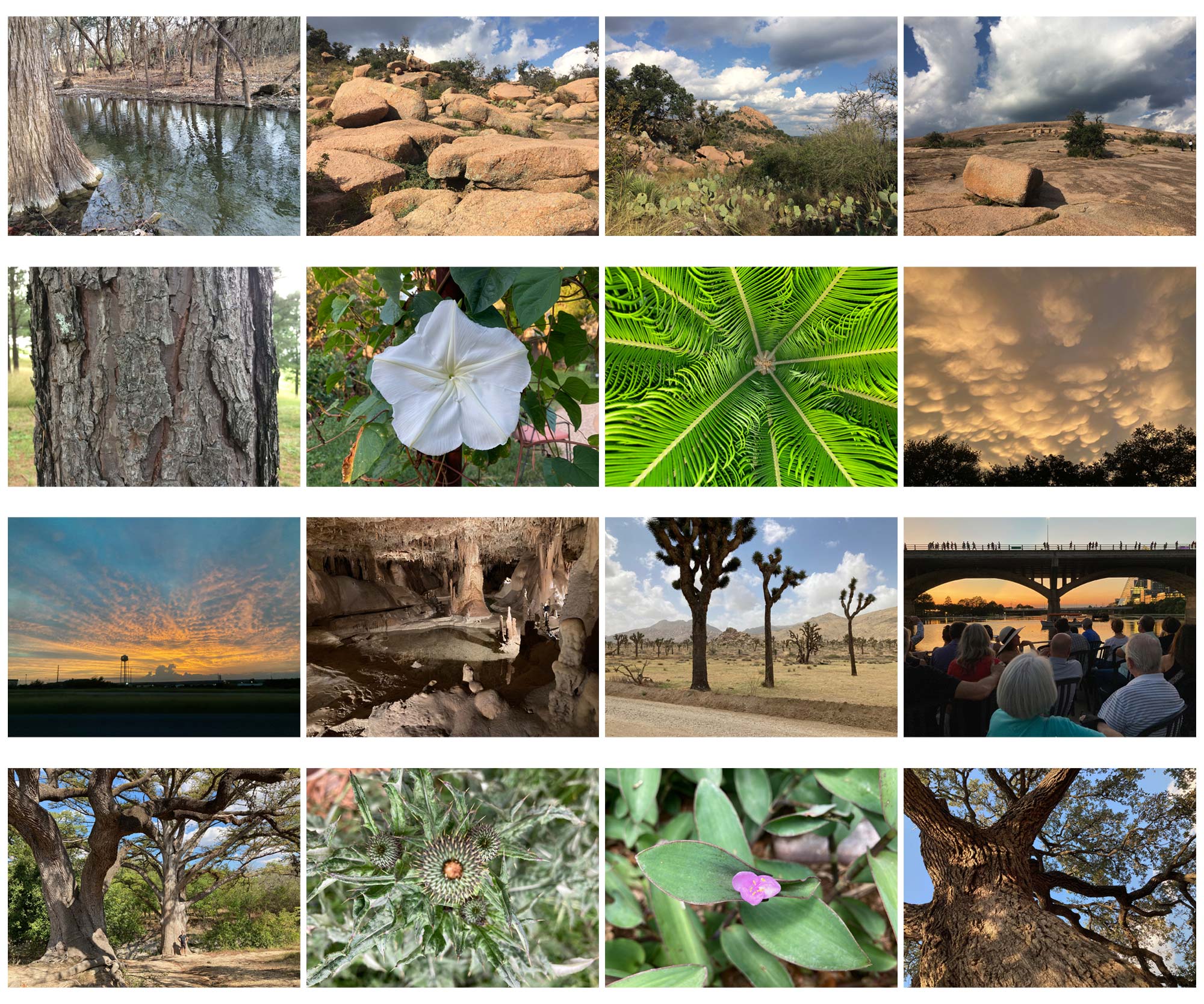
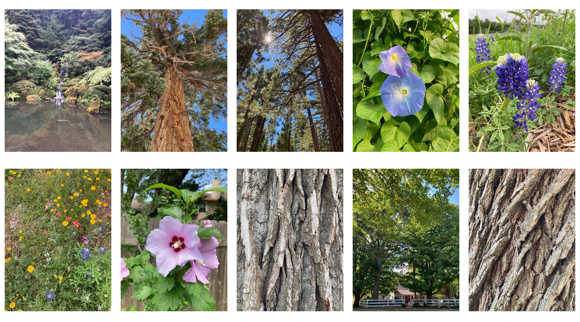
I am a serviceable photographer with some eye for composition, but I’m including these mainly to show that I have a deep appreciation for the beauty of nature and a thing for trees and plant close-ups.
